Sinlahekin Fire
Apparel concepts created in response to the 2026 Sinlahekin Fire in Okanogan County, Washington.
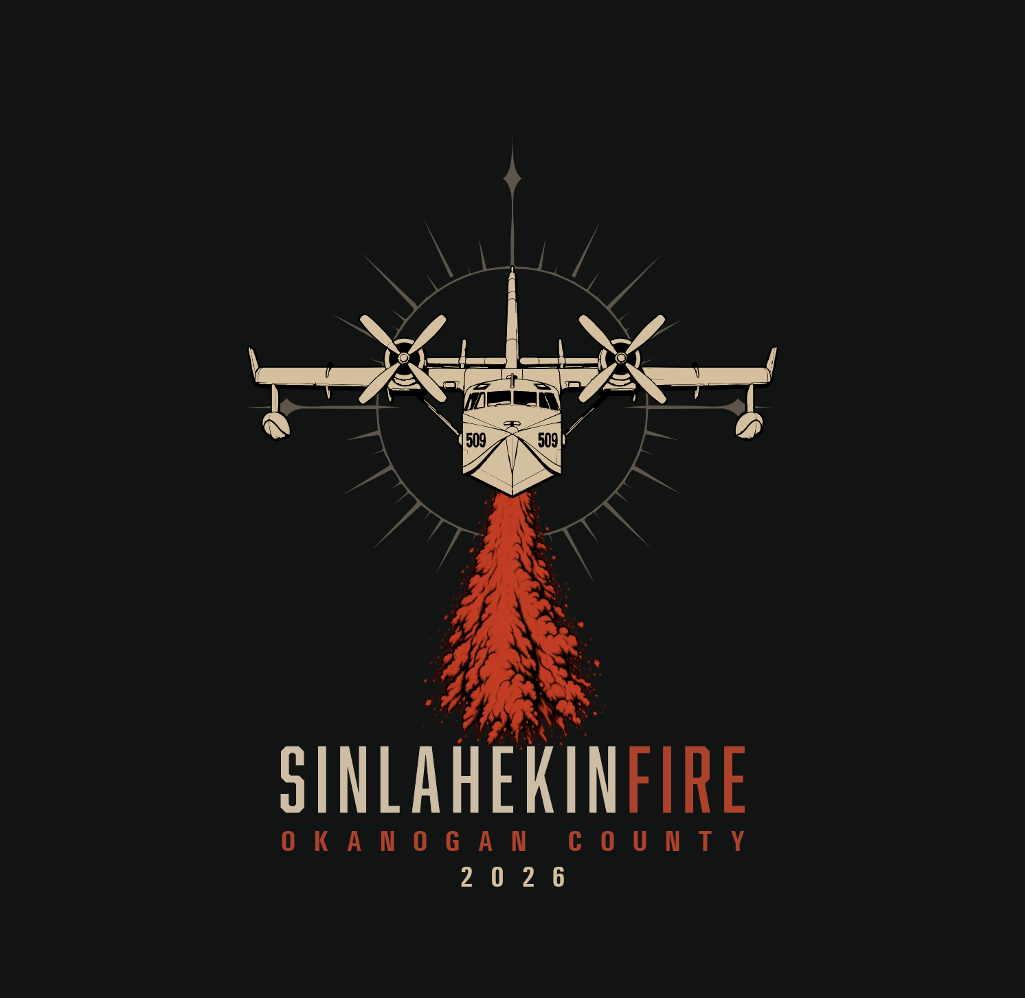
With the Sinlahekin Fire burning close to home, I started exploring a series of T-shirt designs with the idea that proceeds could eventually support local fire recovery efforts.
At the time, entirely AI-generated wildfire shirts were already appearing online, and many shared the same visual language: overly rendered nondescript mountain scenery, dramatic flames and smoke, overly detailed illustration, and familiar AI-generated type treatments. I wanted to deliberately move away from that aesthetic.
My approach was to think of the fire almost as a branding exercise. Rather than illustrate a generic wildfire scene, I wanted to develop a recognizable visual identity around Sinlahekin—something graphic, specific to the place, and intentional enough to feel designed rather than generated.
There was a little irony in the process: I used generative AI as a rapid visual ideation tool during the initial exploration. But those images were starting points rather than finished artwork. Once I found ideas worth pursuing, I moved into Illustrator and took over the design process — rebuilding compositions, typography, color, imagery, and individual graphic elements until the work had moved well beyond the original generations.
Initial exploration
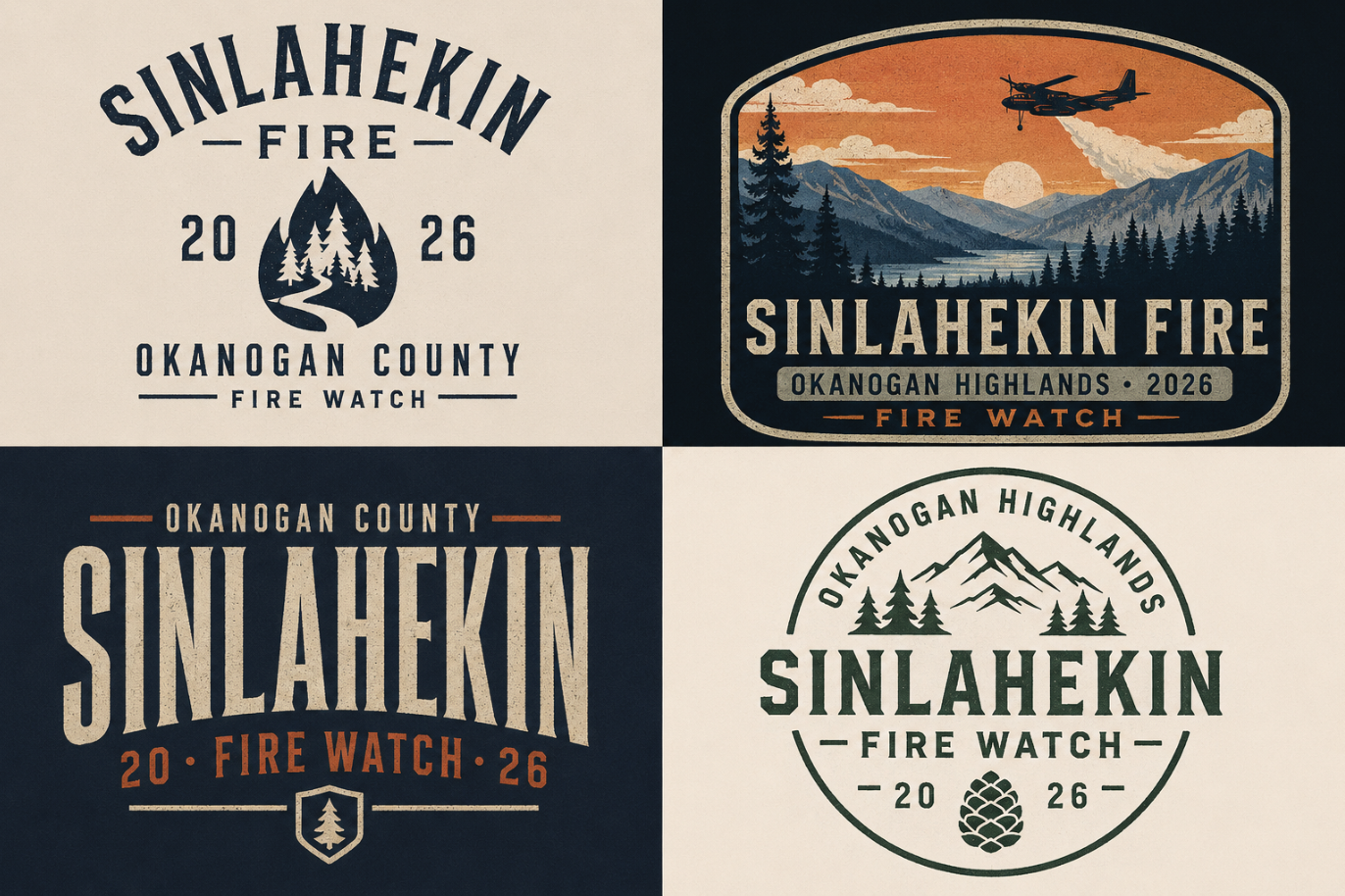
A little AI slop-esque in the first iterations. I moved away from this type, color, and image treatment to something simple, starker, and solemn given the nature of the subject matter.
The first AI-generated round functioned almost like visual thumbnailing. I explored combinations of mountains, fire, smoke, firefighting imagery, typography, and regional references quickly enough to determine which ideas had potential.
Just as important was identifying what I didn't want. Anything that began to resemble the generic AI wildfire aesthetic was pushed further, stripped down, rebuilt, or abandoned entirely.
The goal wasn't to make AI art look better. It was to use AI to rapidly establish a starting point and then design away from the recognizable fingerprints of AI-generated artwork.
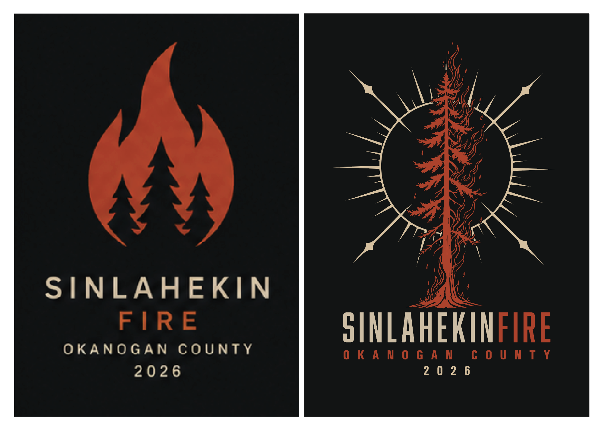
Left: AI generated iteration Right: Similar silhouette and color palette, but under my control entirely. Tree and sun asset produced by AI under my direction. Illustrator Live Trace applied for scalable purposes.
Building an identity
Once I had directions worth pursuing, the project became much more traditional graphic design.
I worked toward a visual language that could make Sinlahekin Fire recognizable on its own: limited color, strong typography, simplified imagery, repeatable graphic elements, and references connected to Okanogan County and the surrounding landscape.
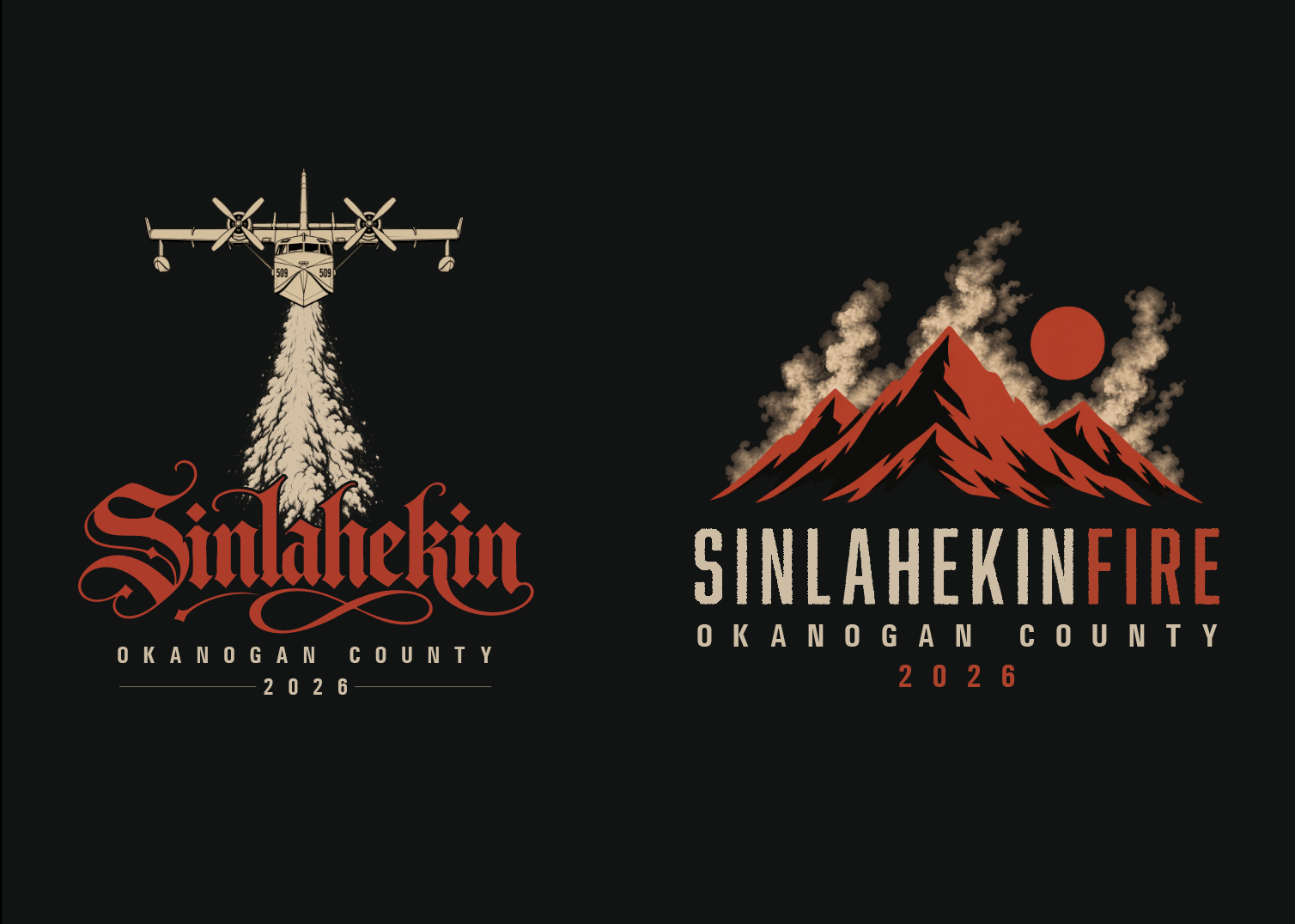
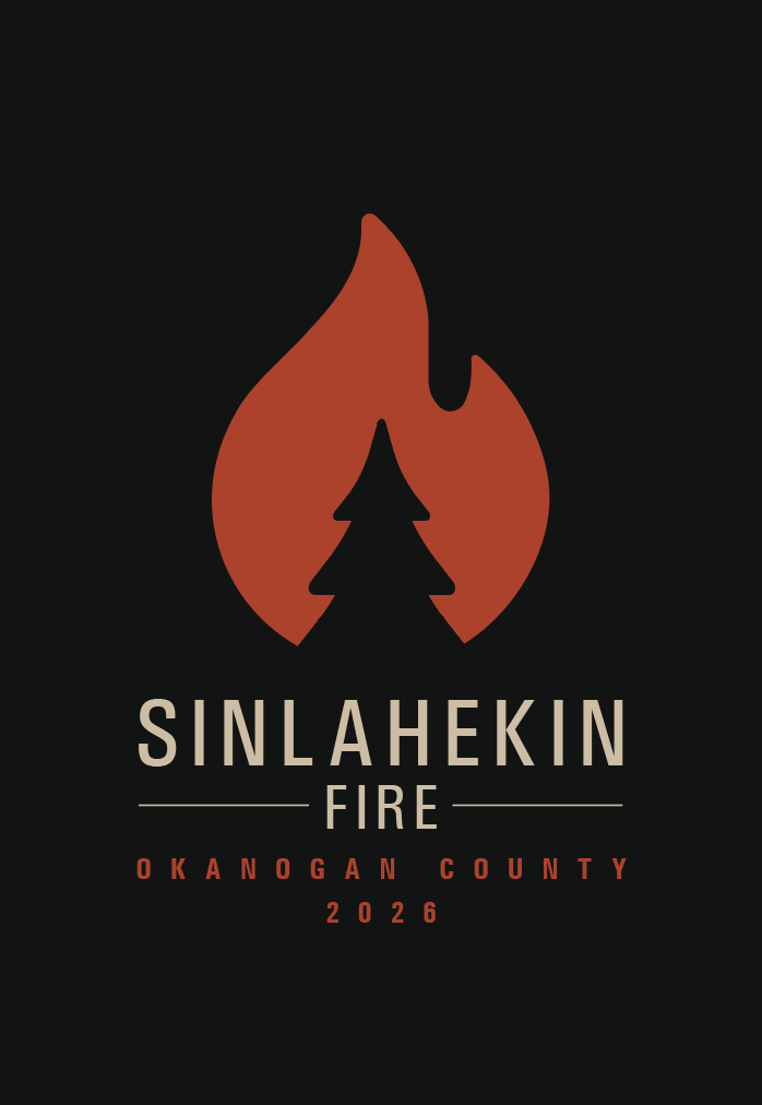
Some ideas disappeared completely. One early direction incorporated a simple flame that a friend pointed out looked suspiciously like marijuana branding. Once I saw it, that was pretty much the end of the flame. Rather than treating each shirt as an isolated illustration, I began thinking about how the pieces could feel related—as if the fire had its own temporary identity system.
Avoiding generic wildfire imagery also meant being more deliberate about place. I explored mountains, smoke, the moon, local flora, firefighting tools, and the Canadair CL-415 rather than relying on interchangeable forests and dramatic fire scenes.
For some individual elements, I used AI sparingly as a utility rather than a design tool: for example, generating basic silhouettes or accurate reference views of the CL-415 that I could bring into Illustrator, Live Trace, and modify.
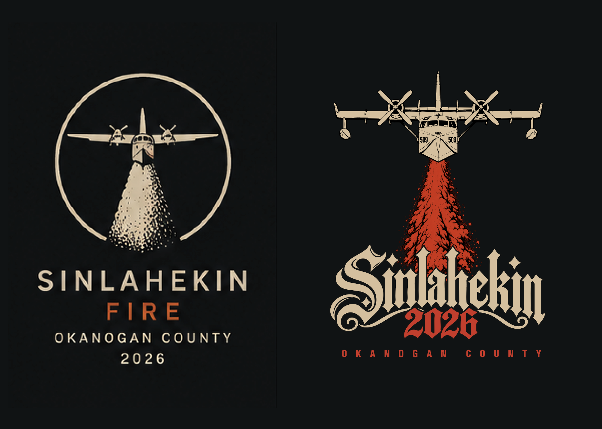
Left: AI-generated reference. Right: The improved and significantly more stylized version. Assets again created by AI, rendered through Live Trace for scalability. Type treatment all mine.
Refinement & feedback
As the concepts developed, I shared them informally with my boyfriend, friends, and a career wildland firefighter.
Feedback ranged from catching unintended associations—the aforementioned weed-brand flame—to simply confirming that a direction was working. It became another filter for deciding what survived.
Most of the later work was straightforward design iteration: simplifying forms, adjusting proportions, refining typography, limiting color, rebuilding individual elements, and making sure the graphics behaved like apparel designs rather than illustrations placed on shirts.
Final concepts
AI helped me explore the initial territory and occasionally supplied raw reference material, but the final identity emerged through selection, reconstruction, typography, composition, vector work, feedback, and iteration.
In a landscape increasingly filled with instantly generated artwork, this project became an experiment in using AI without allowing AI to become the art direction.