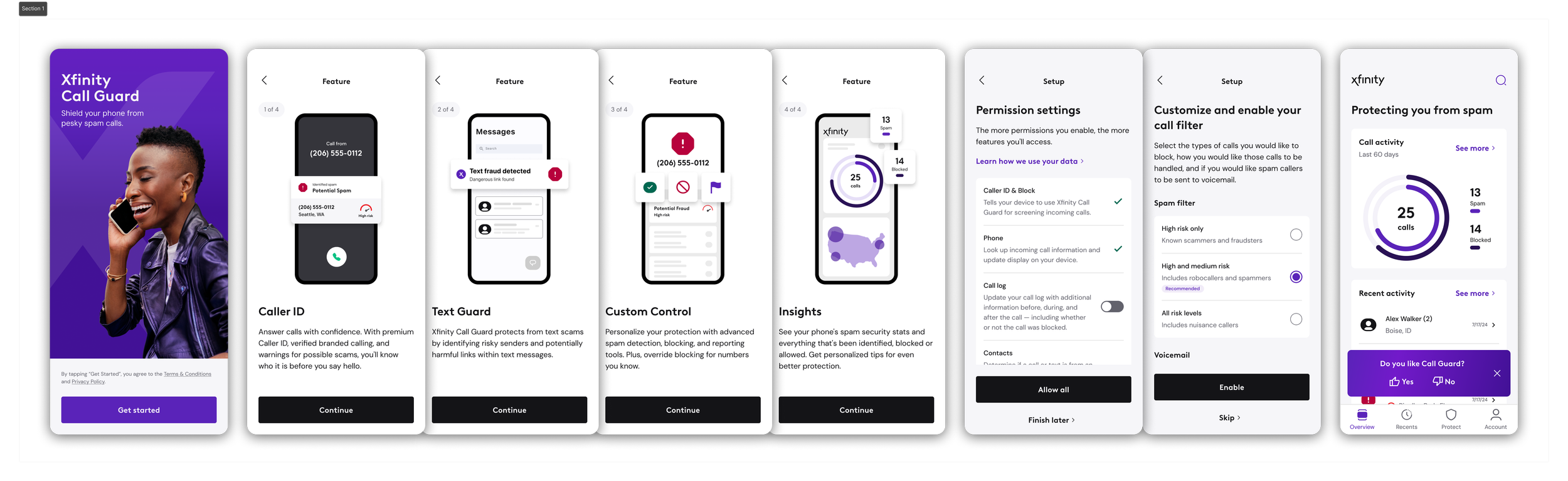
Xfinity Call Guard

Xfinity Call Guard brought TNS's established call-protection capabilities into a new customer ecosystem — not as a simple reskin, but an adaptation to Xfinity's product requirements, brand standards, and platform behavior.
What I owned:
Led onboarding, permissions, and post-launch App Feedback design across iOS and Android, adapting an established Verizon foundation for Xfinity.
Advocated for contextual permission requests to better explain their value; Xfinity ultimately prioritized a shorter onboarding path, leading us to a consolidated model.
Designed around different OS constraints: Android supported direct permission requests and an “Enable All” path, while iOS required customers to leave the app for certain settings.
Directed two supporting designers and led Xfinity design reviews while maintaining consistency across the evolving product.
Result: shipped to an estimated 1M Xfinity Mobile subscribers, with my contribution recognized by a $10K spot bonus.
ROLE
Lead Designer
TEAM
2 Product Designers
Design Manager
Project Manager
DURATION
Sep 2024 - Aug 2026
LAUNCH
April 2025
OBSTACLE: ONBOARDING WAS MORE THAN INTRODUCTION
Call Guard inherited much of Verizon Call Filter's onboarding structure — Get Started, feature introduction, permission setup, and block-settings setup. The challenge was determining how permissions should work for Xfinity: how they should be sequenced, what happens when someone leaves before finishing, and what actually counts as complete.
Those decisions were complicated by OS-level permissions and roles that affected authentication and protection differently across iOS and Android. We needed to balance the experience Xfinity wanted with what each platform required before protection could actually function.
DECISION: HOW SHOULD PERMISSIONS BE INTRODUCED?
Drawing from existing Call Filter patterns, competitive research, and platform constraints, we initially pushed for a progressive approach: introduce each permission immediately after explaining the feature that required it.
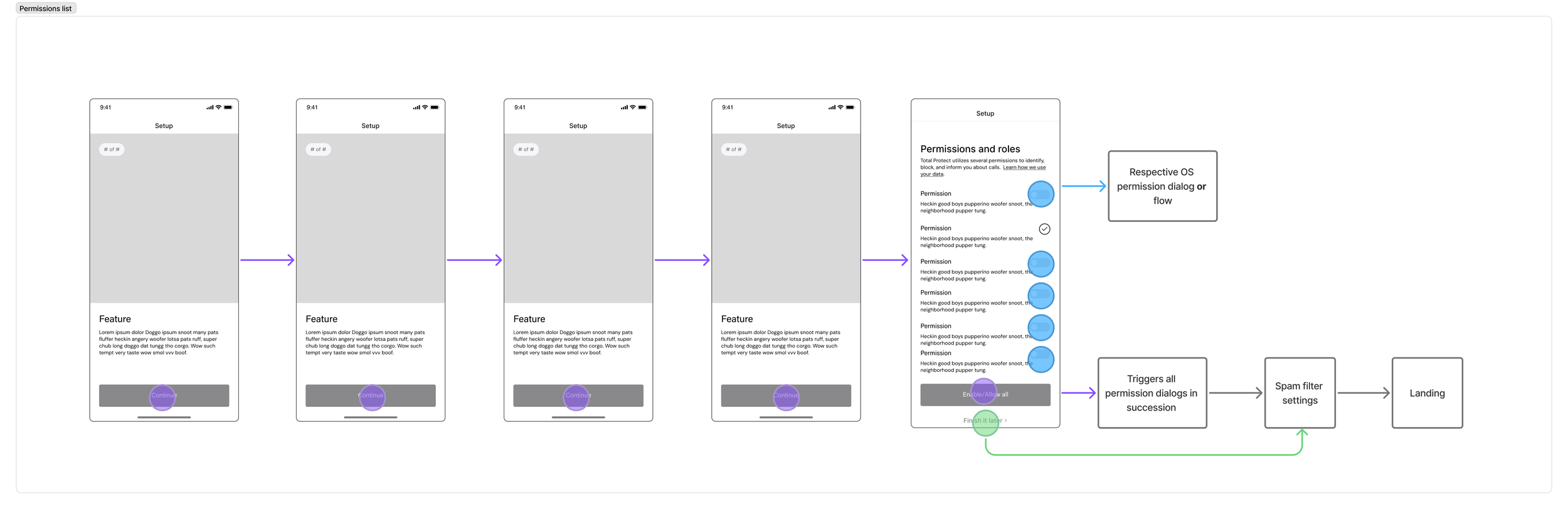
The inherited permissions-list model told customers what to enable, but gave us less opportunity to explain why each permission mattered. Connecting a request directly to its benefit created more context at the moment we were asking for access.
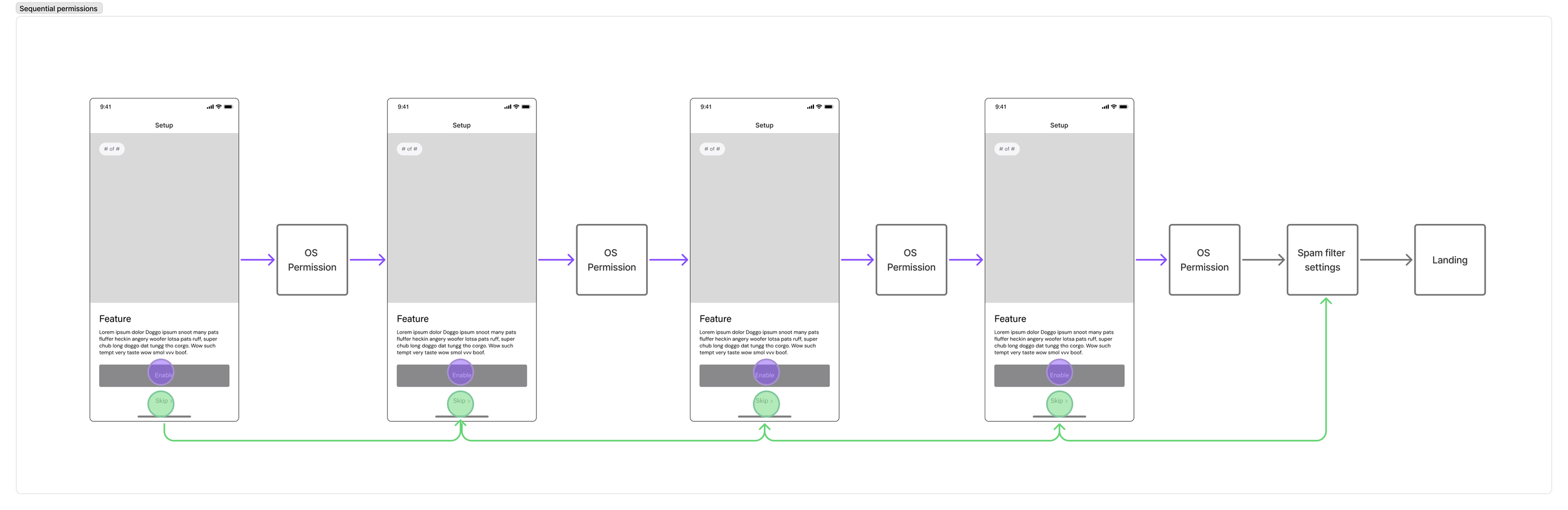
Xfinity saw a different risk. They wanted customers into the app quickly and were concerned a longer, feature-by-feature sequence could hurt completion. The experience ultimately moved toward a consolidated permissions list — a deliberate tradeoff of less context at each request for a shorter path into the product.
This wasn't formally A/B tested. With more runway, I would have tested both approaches, particularly on iOS.
MECHANICS: WHY iOS AND ANDROID COULDN'T MATCH
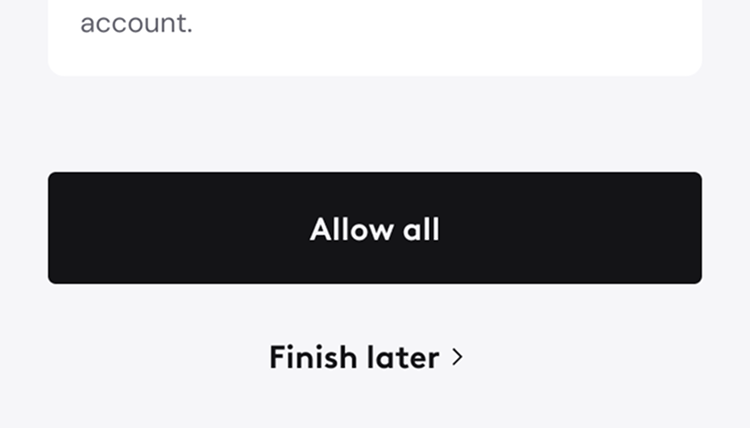
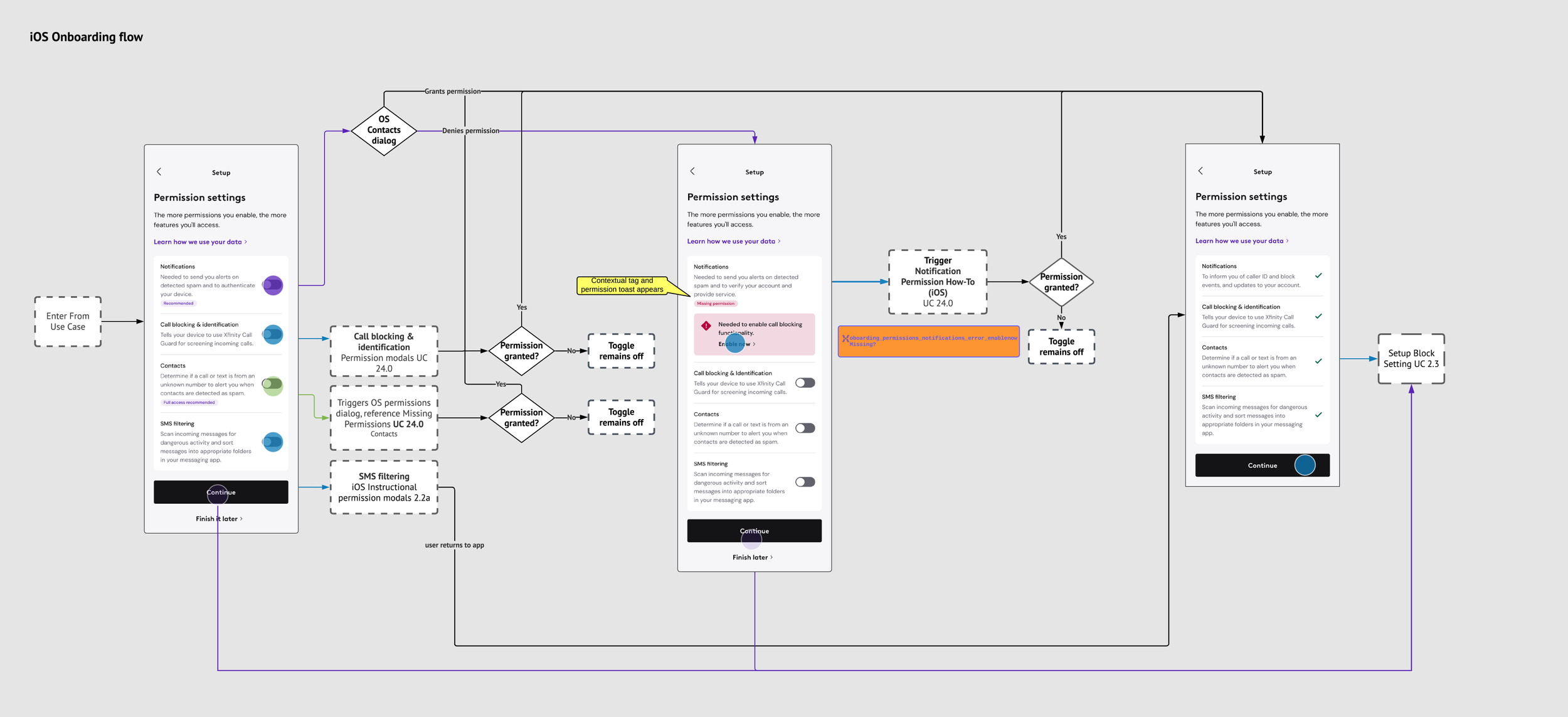
The final permissions lists look similar, but their mechanics diverge for a real reason. Android can request permissions directly in-app, allowing us to offer an Enable All path. iOS requires customers to leave the app for certain settings, such as Call Blocking & Identification, making the same batch action impractical.
The iOS experience therefore had to clearly support leaving for system settings, returning to Call Guard, skipping permissions, and continuing without creating a dead end.
VISUAL DESIGN: BRINGING CALL GUARD INTO XFINITY'S BRAND
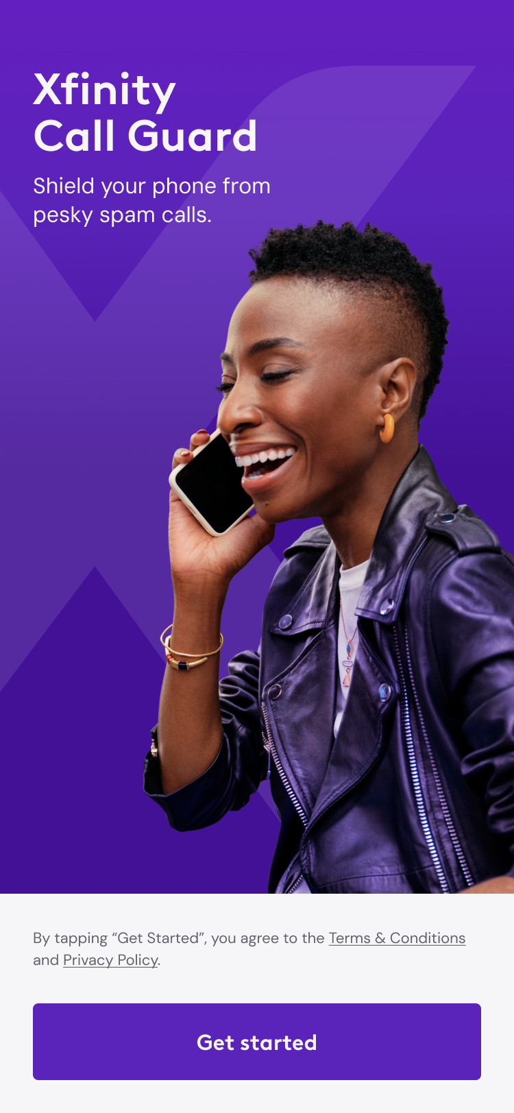
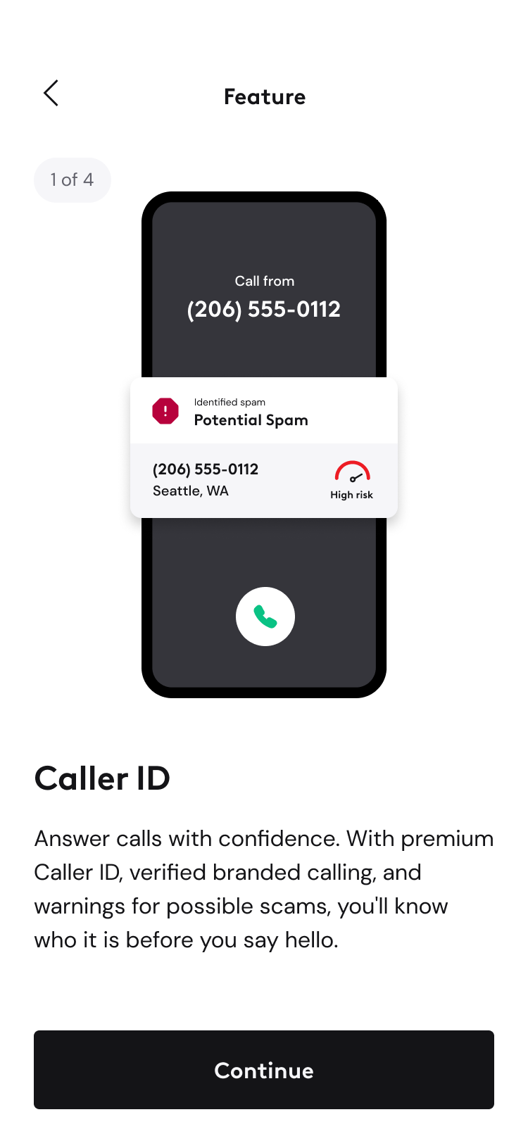
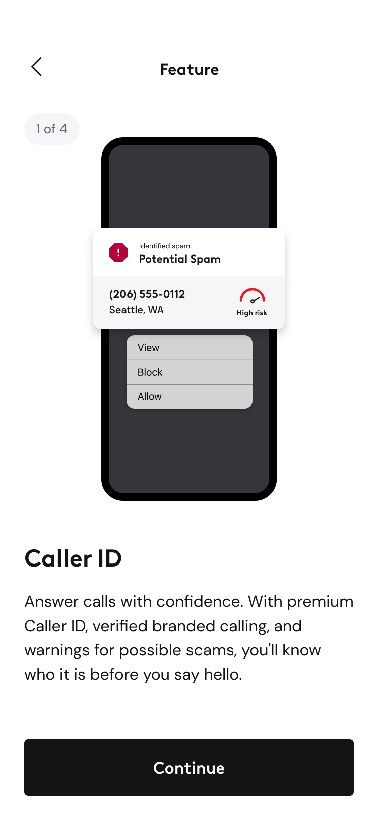
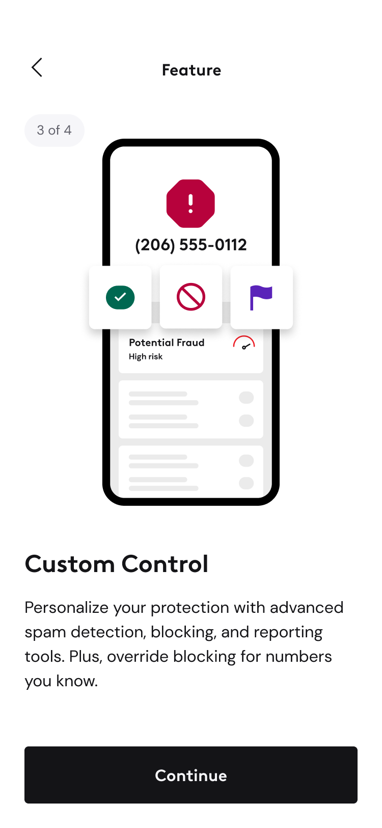
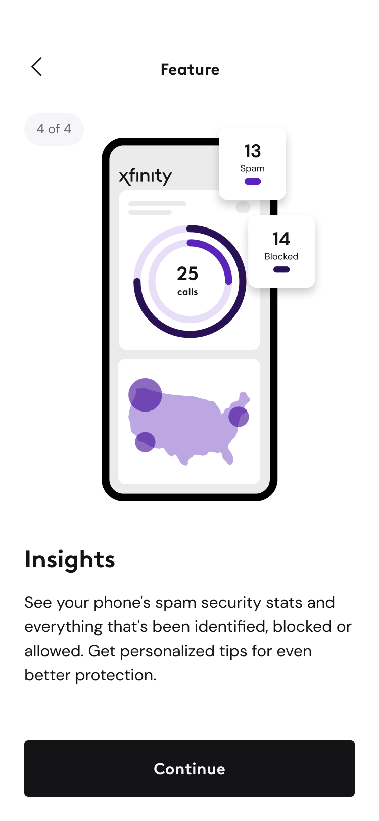
I also designed Call Guard's Get Started experience and feature illustrations using Xfinity's established brand assets and visual language. Early concepts explored animation, but motion was scoped out of the initial release and the visual direction carried into the final static illustrations.
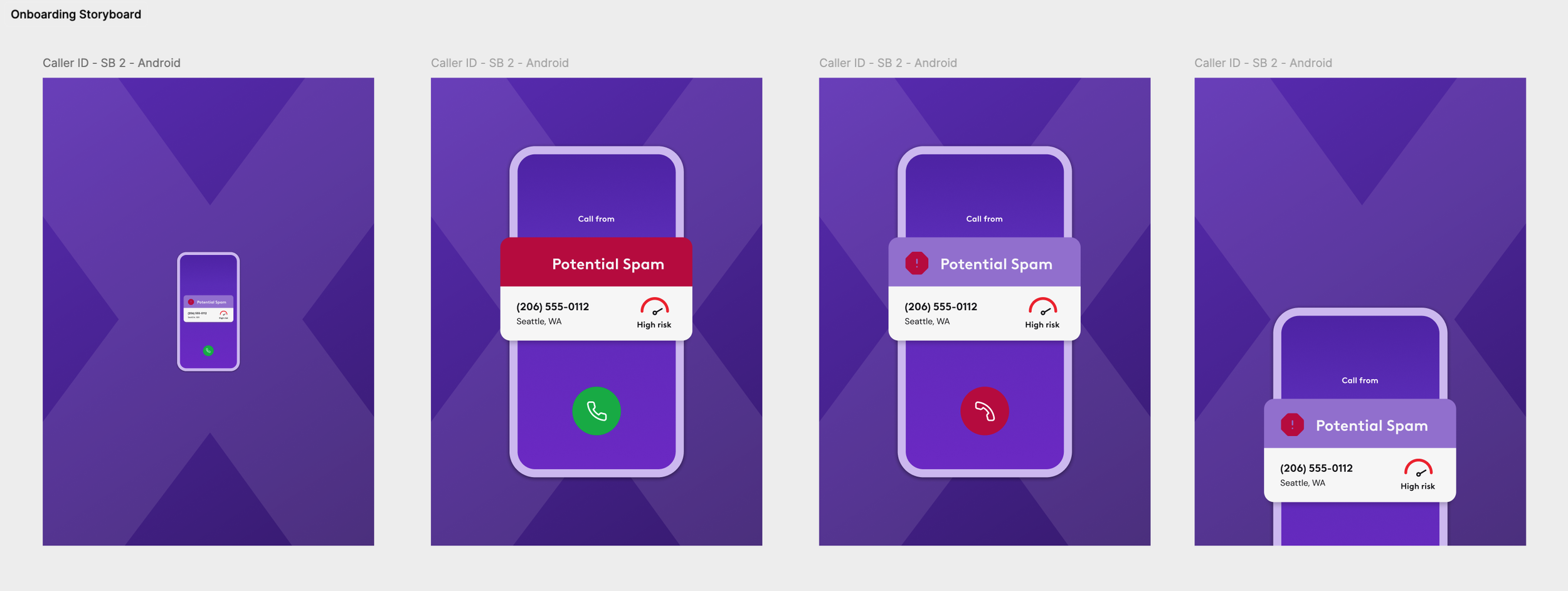
Working through reviews with my design manager and Xfinity, the illustrations evolved to fit Xfinity's preference for using its signature purple sparingly while still giving Call Guard a distinct visual identity.
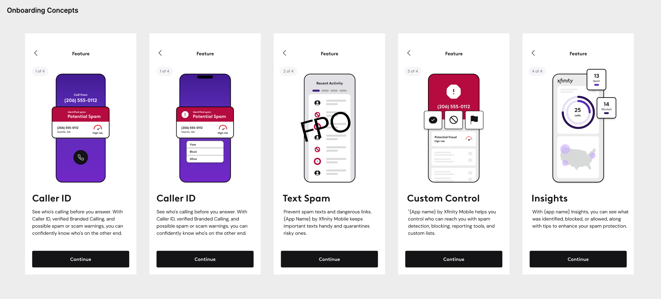
I'd review concepts briefly with my design manager before bringing them to Xfinity for critique, then incorporate their feedback into the next round. One recurring consideration was color: Xfinity preferred using their signature purple sparingly, so the illustrations evolved to balance that restraint with a visual language that still felt distinctive to Call Guard.
SYSTEMS: KEEPING THE EXPERIENCE COHERENT
As requirements evolved, I maintained decisions across shared documentation, reviewed changes with Xfinity, and clarified behavior for Engineering and QA. I also directed two supporting designers, using regular syncs and design reviews to keep related features aligned with the broader interaction model.
That became especially important post-launch as new capabilities were added: even when another designer owned an individual feature, I remained involved in Xfinity reviews and maintained consistency across the larger experience.
POST-LAUNCH: A RATING WOULDN'T TELL US WHAT WAS WRONG
Xfinity's initial ask was broad: give customers a way to provide feedback within Call Guard. Early exploration — including using Copilot to explore wireframe concepts and organize working documentation — quickly surfaced a larger question: how could we collect feedback that told us what was actually working or not working, rather than simply whether someone liked the app?
I reviewed patterns from other products and spoke with a colleague who had worked on a similar TNS feedback experience. From there, I explored potential entry points across Call Guard and ways to collect structured feedback around actual customer issues.
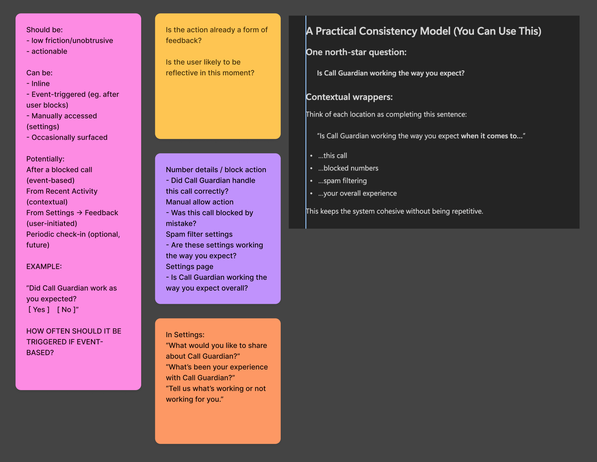
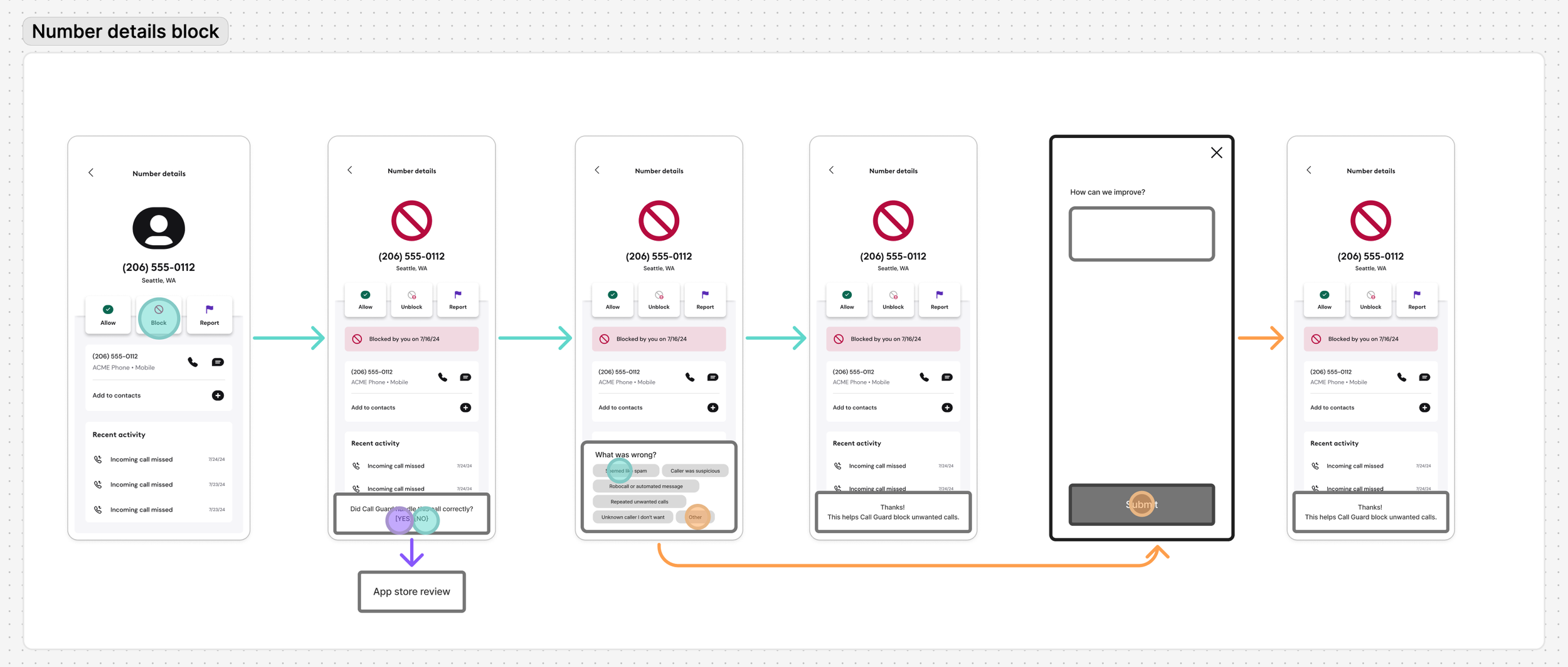
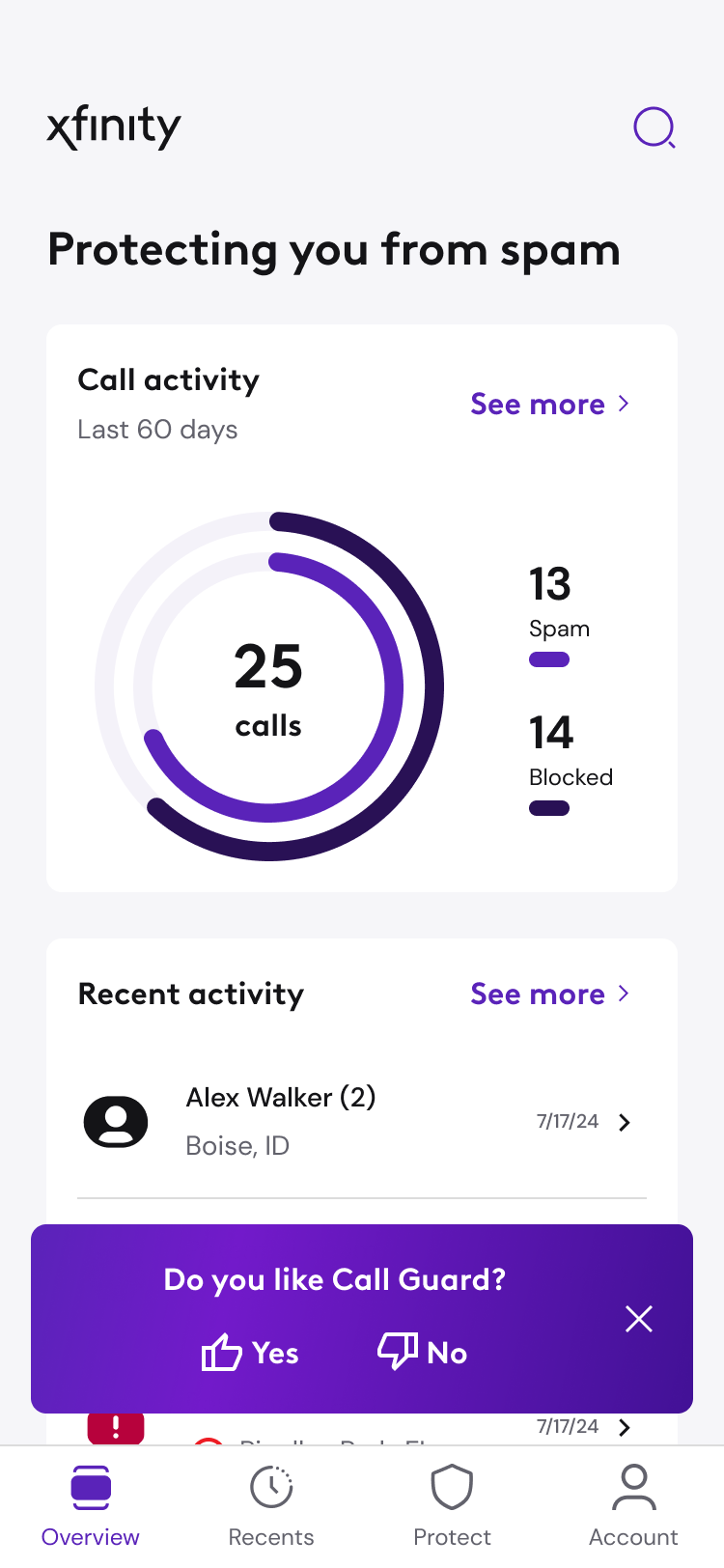
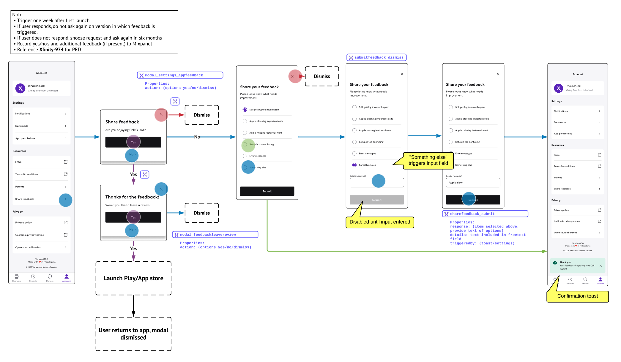
Given the timeline and available engineering resources, the final implementation was intentionally narrower. A lightweight feedback toast appeared on Overview at defined points in the customer lifecycle, while Share feedback remained permanently available through Account.
Positive responses could lead to an app-store review; negative responses surfaced predefined issues with space for additional detail — turning a simple rating prompt into more actionable feedback.
OUTCOME: WHAT THIS PROJECT DEMONSTRATES
Call Guard looks straightforward because much of its complexity lives underneath the interface. My role was making that system coherent for a new customer ecosystem — designing cross-platform onboarding and permissions, leading supporting designers and Xfinity reviews, maintaining the interaction model as requirements evolved, and extending the experience after launch.
The product shipped to an estimated 1 million Xfinity Mobile subscribers, and my contribution to the project's overall success was recognized with a $10,000 spot bonus in 2026.