LAUNCHED
April 2025
TEAM
2 Product Designers · Design Manager · Project Manager
Xfinity Call Guard
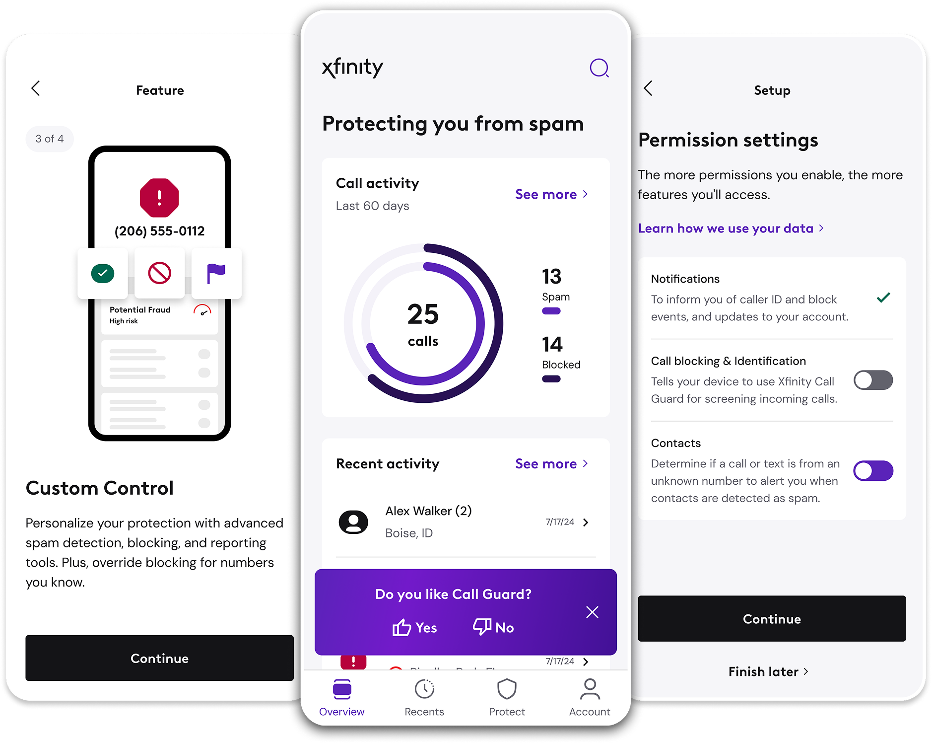
Xfinity Call Guard brought TNS's established call-protection capabilities into a new customer ecosystem. The work was not a simple reskin: Xfinity introduced different product expectations, brand requirements, eligibility rules, platform behavior, and permission needs.
As design lead, I helped guide that adaptation while directly owning key parts of the experience, including onboarding and permissions across iOS and Android.
I worked across interaction design, stakeholder reviews, shared IxD documentation, engineering collaboration, and implementation support. I later designed Call Guard's in-app feedback experience.
ROLE
Lead Product Designer
DURATION
Sep 2024 - Jul 2026
OPTIONAL One restrained Call Filter -> Call Guard counterpart only if it makes the inherited foundation
FOUNDATION VISUAL
clearer. Do not frame the project as greenfield.
Call Guard depended on OS-level permissions and roles that affected authentication and protection behavior, and those requirements differed across iOS and Android. The onboarding model therefore had to do more than introduce features - it had to mediate between customer intent and operating-system requirements.
04 DECISION: HOW SHOULD PERMISSIONS BE
INTRODUCED?
Early exploration considered two models: a consolidated Permission Dashboard and Sequential Permissions per Feature. The tradeoff was efficiency versus context. A dashboard made setup state easier to scan, while contextual requests could better explain why each permission mattered.
This is a good place to show design reasoning explicitly. The artifact is not important because it proves that wireframes existed; it is important because it proves that competing approaches were evaluated.
05 DESIGN RESPONSE: MAKE SETUP STATUS VISIBLE
The resolved experience used a shared setup model while respecting different OS mechanics. The Permissions progress page reflected the customer's actual state: granted permissions were recognized, missing permissions remained actionable, and completing required setup changed the available actions.
A useful principle to surface here is visibility of system status. You do not need a section titled 'Heuristic Evaluation.' The design itself demonstrates the principle.
06 OBSTACLE: USERS COULD LEAVE SETUP INCOMPLETE
Setup could not be treated as an all-or-nothing gate. Customers could continue without enabling everything, which meant incomplete state had to survive beyond onboarding. When a customer later encountered a feature that depended on a missing permission, Call Guard needed to explain the limitation and provide a recovery path.
This is one of the strongest stories in the case study because it shows that onboarding was a system, not a sequence of welcome screens.
PROCESS Show one dated October 2024 onboarding WIP canvas. Let the full artifact establish
EVIDENCE
complexity, then use one or two readable crops rather than a wall of tiny screens.
SIDE-BY-SIDE Permission Dashboard concept beside Sequential Permissions per Feature. Add one short
EXPLORATION
caption beneath each explaining the tradeoff.
FINAL SOLUTION Final Permissions progress page plus ONE meaningful iOS/Android comparison. Keep the comparison focused on a real behavioral difference, not visual trivia.
STATE SEQUENCE Compact 3-4 state sequence: partial setup -> Finish later / continue -> dependent feature encounters missing permission -> recovery / return from OS Settings.
07 PIVOT: ONE iOS REQUIREMENT CHANGED THE SYSTEM
Late in development, an iOS notification requirement forced the team to revisit an assumption tied to authentication and onboarding. That change propagated into Permissions settings, recovery behavior, and downstream protection controls that depended on full notification access.
Use this moment to show how product design work responds when a platform constraint changes after a system is already interconnected.
08 SYSTEMS WORK: KEEPING THE EXPERIENCE
COHERENT
As requirements evolved, I maintained decisions across shared Figma and IxD documentation, reviewed changes with the team and Xfinity, and helped clarify behavior for development and QA. The work was less about isolated screens and more about keeping interconnected states from contradicting one another.
This section is where the case study can demonstrate systems thinking and design leadership without relying on a title to make the claim.
09 POST-LAUNCH: CREATING AN IN-APP FEEDBACK LOOP
After launch, I designed Call Guard's in-app feedback experience. The final flow balanced an always-available path through Account with a lightweight prompt on Overview. Positive responses could continue toward an app-store review, while negative responses collected structured feedback and optional detail inside Call Guard.
This section also proves that the work continued beyond initial launch and that the product evolved after customers were using it.
10 CLOSE ON WHAT THE PROJECT DEMONSTRATES
Call Guard looks straightforward on the surface because much of the complexity lives underneath it. My contribution was to help make that system coherent for a new customer ecosystem - directly designing onboarding and permissions across platforms, accounting for incomplete and changing states, maintaining the shared interaction
RETROSPECTIVE Simple diagram: iOS notification constraint -> Authentication / Onboarding / Permissions /
IMPACT DIAGRAM + REAL UI
Filters + Blocking / Recovery. Label it as a simplified retrospective view, then pair it with an authentic final state showing a downstream consequence.
IXD / One strategic IxD overview crop that visibly demonstrates branching or cross-use-case
DOCUMENTATION
logic, followed by 2-3 enlarged callouts. Do not use an unreadable full-canvas screenshot by itself.
FINAL APP Reuse the Overview screen with the purple feedback component as a visual callback to the
FEEDBACK FLOW
hero. Then show a concise 3-4 state flow: Yes/No -> negative feedback form OR positive review path -> confirmation.
model through implementation, and creating a lightweight feedback loop after launch.
Key takeaway: Good onboarding is not simply a sequence of welcome screens. It is the interface between what a customer wants to do and everything the product and operating system require to make it possible.