Call Filter upsell
verizon // 2020-2021
BACKSTORY & Objective
Verizon’s Call Filter mobile app (built by TNSI) screens incoming calls to protect users from scam callers. Call Filter also provides insights to types of spam, their associated risk levels, and other analytics. There are two main license states: paid and free.
The task was to design a new upsell page that converts free licensed users to paid. The upsell needed to highlight the new and existing paid features and provide a CTA inviting users to subscribe. I wanted to show users the new features rather than just telling them what they were.
MY ROLE Product Designer
TEAM UX Manager, Sr. Project Manager
Responsibilities
Exploration, research, wireframing, concepting, final product, documentation
Tools
Keynote (rough concept)
Sketch (concept and final)
After Effects (GIF production)
Lucid Chart (documentation)
Teams
OneDrive
Challenges
Incorporate Verizon’s, at the time, new brand guide which entailed predominant black and white usage and little color.
EXPLORATION & RESEARCH
I examined upsell pages and components associated with subscription-tiered products, like those found on platforms like Spotify, Netflix, and other streaming services. While I also considered competitors like Robokiller and Hiya, their approaches seemed somewhat repetitive, presenting free and paid features in a basic column format with clear calls-to-action for making a purchase.
I analyzed Verizon's website alongside competitor research to glean insights into design patterns and brand alignment. This exploration aimed not to mimic but to determine effective strategies. Our objective was to display Call Filter's premium features beyond mere feature comparisons.
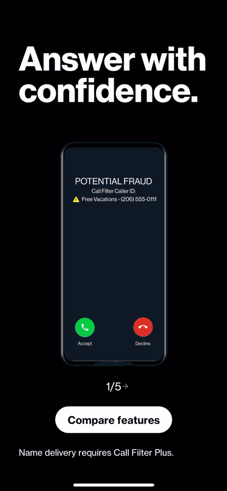
I conceptualized some static designs in Sketch and collaborated with the UX and Project managers for feedback. During these discussions, I expressed a desire to incorporate animations, either through coding by our developers or by using After Effects. To communicate these ideas effectively to Verizon, my PM requested I created rough animations in Keynote, making it easy for him to share them with Verizon stakeholders. Once Verizon approved the concept, we proceeded with internal review cycles. The animations consisted of existing UI within the app that captures the paid features. They needed to be exaggerated in the upsell demonstration to capture user interest.
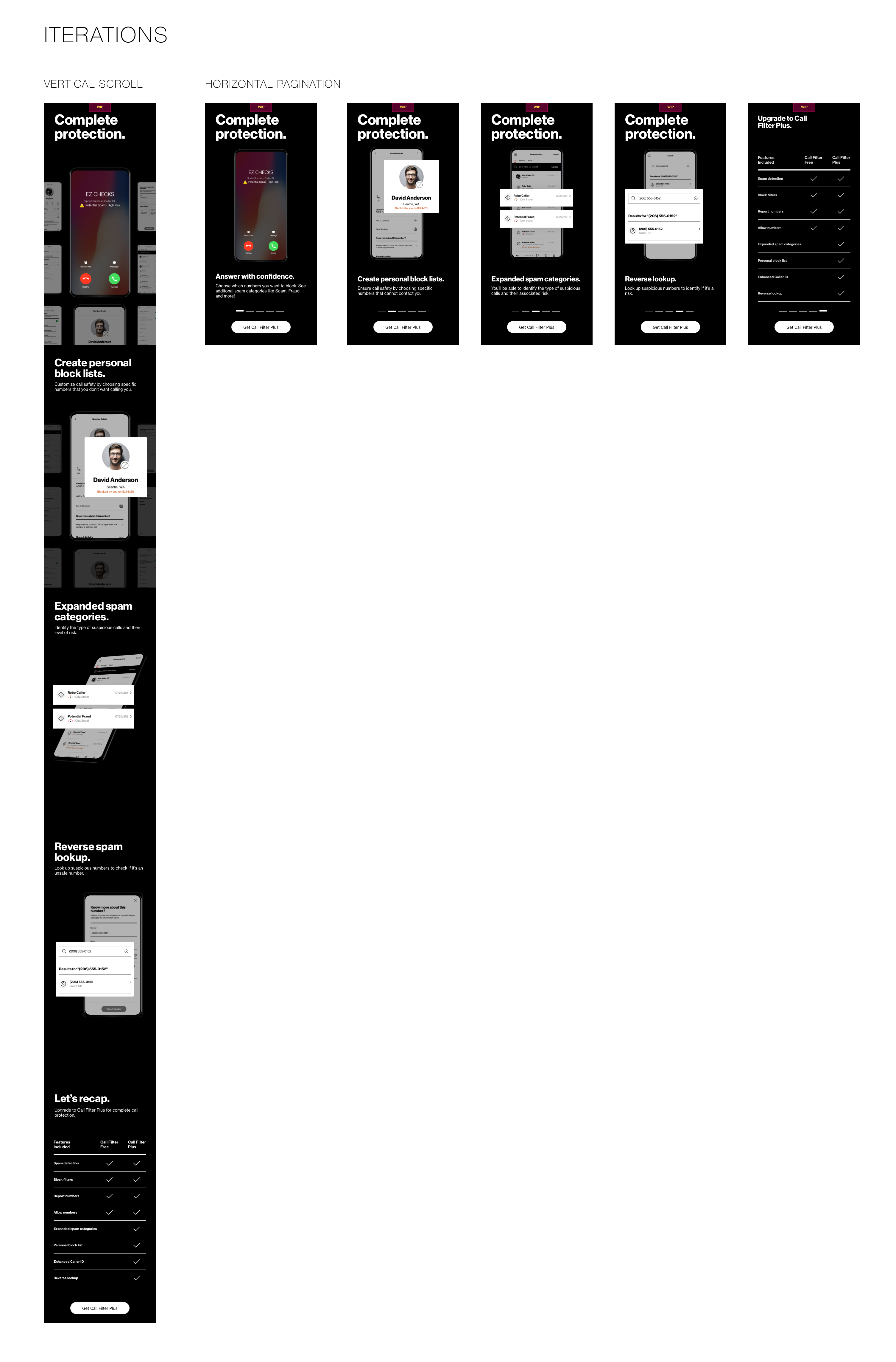
Earlier concepts containing vertical pagination.
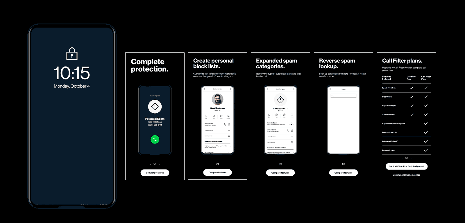
I crafted a Sketch document with annotations for developers, complemented by individual animations made in After Effects and exported as GIFs. Collaborating with my UX manager, we fine-tuned timing and fluidity. In later reviews, we opted to orient feature slides horizontally to better match app patterns. The upsell is integrated into the Call Filter onboarding flow and activated on select pages within the free app version.
Outcome
After delivering assets to dev, the internal Call Filter interaction guide needed to be updated with the new Upsell screens. The upsell design went live in Fall 2021.
Final product!
Early lo-fi concepts
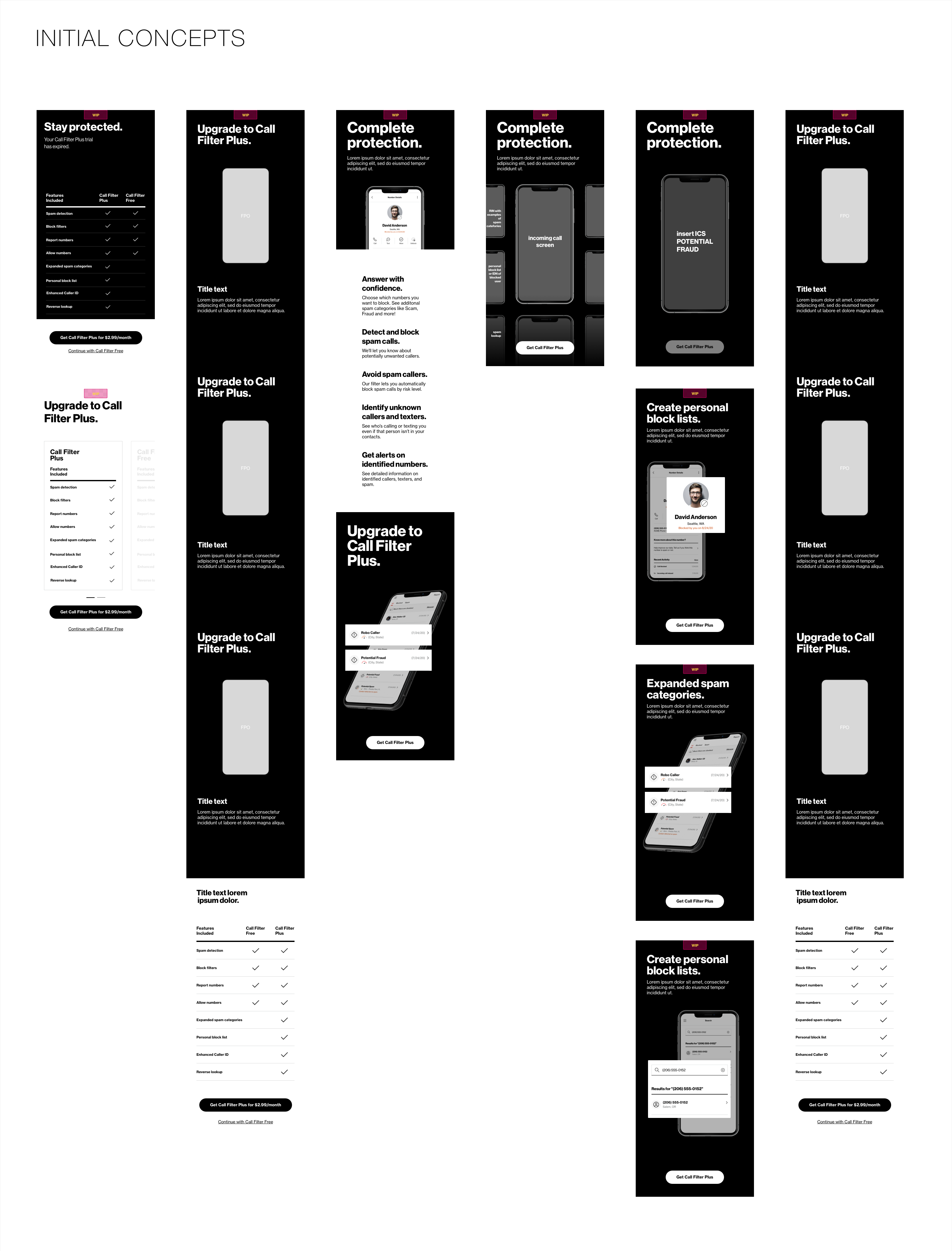
I explored a variety of concepts; some were more visually similar to what Call Filter has used in the past for feature comparison for paid and free subscription tiers. The others explored use of animations (using placeholders in this version) with write ups of each feature. Reviewing these concepts, we (me, UX manager, and PM) landed on the more visual-centric concept on the far right that was easy for our devs to implement with respect to their bandwidth.
Additional concepts
As I progressed through the concept phase, I started refining design components that I’d ultimately export into After Effects.